Cursor Figma
What is Cursor Figma
cursor-figma is a project that utilizes Figma designs to create mobile application interfaces, showcasing various screens such as Discover, Search, and Chat pages using HTML and Tailwind CSS.
Use cases
Use cases include showcasing mobile app designs to clients, comparing different interface layouts, and serving as a template for building responsive web applications.
How to use
To use cursor-figma, clone or download the project to your local machine, then open the ‘index.html’ file in a web browser. You can switch between horizontal and vertical display modes using the buttons at the top.
Key features
Key features include responsive design for different screen sizes, mode switching between vertical and horizontal layouts, finely crafted UI components, smooth transition animations, and a clear project structure for easy maintenance.
Where to use
cursor-figma can be used in mobile application development, UI/UX design presentations, and as a reference for developers looking to implement Figma designs into front-end code.
Clients Supporting MCP
The following are the main client software that supports the Model Context Protocol. Click the link to visit the official website for more information.


Overview
What is Cursor Figma
cursor-figma is a project that utilizes Figma designs to create mobile application interfaces, showcasing various screens such as Discover, Search, and Chat pages using HTML and Tailwind CSS.
Use cases
Use cases include showcasing mobile app designs to clients, comparing different interface layouts, and serving as a template for building responsive web applications.
How to use
To use cursor-figma, clone or download the project to your local machine, then open the ‘index.html’ file in a web browser. You can switch between horizontal and vertical display modes using the buttons at the top.
Key features
Key features include responsive design for different screen sizes, mode switching between vertical and horizontal layouts, finely crafted UI components, smooth transition animations, and a clear project structure for easy maintenance.
Where to use
cursor-figma can be used in mobile application development, UI/UX design presentations, and as a reference for developers looking to implement Figma designs into front-end code.
Clients Supporting MCP
The following are the main client software that supports the Model Context Protocol. Click the link to visit the official website for more information.
Content
移动应用界面展示项目
项目概述
这是一个基于Figma设计稿实现的移动应用界面展示项目。项目使用HTML和Tailwind CSS构建,展示了三个不同的移动应用界面:发现页面、搜索页面和聊天页面。项目支持水平和垂直两种展示模式,方便比较和查看不同界面的设计。
效果展示
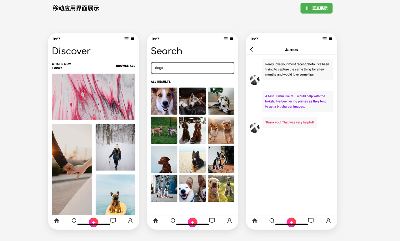
项目效果展示:三个移动应用界面的水平展示模式
技术栈
- HTML5
- Tailwind CSS
- 原生JavaScript
- Google Fonts (Roboto、Comfortaa)
- SF Pro Text字体 (iOS系统字体)
界面展示
项目展示了三个移动应用界面:
-
发现页面 (Discover)
- 顶部状态栏(时间、信号图标)
- 标题栏和分类标签
- 图片网格展示(多种尺寸的图片布局)
- 底部导航栏(5个功能图标)
-
搜索页面 (Search)
- 搜索框和输入提示
- 搜索结果标题
- 3列图片网格展示搜索结果
- 相同的底部导航栏
-
聊天页面 (Chat)
- 顶部导航栏带用户名和返回箭头
- 聊天气泡界面
- 不同颜色标识不同发送者的消息
- 消息气泡样式区分
功能特色
- 响应式设计:适应不同屏幕尺寸
- 展示模式切换:
- 垂直展示模式:三个界面垂直排列
- 水平展示模式:三个界面水平排列
- 精细UI组件:
- 苹果iOS风格的状态栏
- 渐变色上传按钮
- 消息气泡效果
- 图片网格布局
- 动画过渡:模式切换时的平滑过渡效果
项目结构
/
├── index.html      # 主HTML文件,包含所有界面
├── img/            # 图片资源目录
│   ├── image1.png  # 发现页面图片
│   ├── image2.png
│   ├── ...
│   ├── search1.png # 搜索页面图片
│   ├── search2.png
│   ├── ...
│   ├── avatar1.png # 聊天页面头像
│   └── avatar2.png
├── screenshot/     # 截图目录
│   └── demo.png    # 项目效果截图
└── README.md       # 项目说明文档
使用方法
- 克隆或下载项目到本地
- 直接在浏览器中打开
index.html文件 - 通过顶部的"水平展示"/"垂直展示"按钮切换展示模式
特殊设计细节
- 字体选择:使用Comfortaa字体作为大标题,Roboto作为正文,SF Pro Text作为iOS风格元素
- 图标设计:所有图标使用SVG格式,确保高清显示
- 配色方案:遵循设计稿中的色彩方案,包括特殊的渐变按钮(从粉色到橙色)
- 圆角处理:手机外观使用大圆角(40px),内部元素使用小圆角增加现代感
- 阴影效果:适当使用阴影增强立体感和层次感
优化与扩展
本项目针对展示需求进行了优化:
- 代码组织清晰,便于维护和扩展
- 样式使用CSS和Tailwind混合方式,提高开发效率
- 使用flex和grid布局,实现复杂的界面结构
- 响应式设计确保在各种设备上都能良好展示
浏览器兼容性
项目使用现代CSS特性和Flex/Grid布局,支持所有主流现代浏览器:
- Chrome, Firefox, Safari, Edge (最新版本)
- 不支持IE浏览器
未来可能的改进
- 添加深色模式支持
- 实现更多交互功能
- 优化移动设备上的体验
- 增加更多的界面展示
Dev Tools Supporting MCP
The following are the main code editors that support the Model Context Protocol. Click the link to visit the official website for more information.